A Designer’s Guide to Instagram Stories

Posted By Bianca Lev on October 18, 2017
Ask any graphic designer their favorite social media platform and I can almost guarantee with absolute certainty their answer will be Instagram. From day one, the photo-focused platform found and cemented its place in the hearts of the aesthetic obsessed among us. When the platform introduced Instagram Stories, a clear (and bold) copycat move that borrowed more than a few features from Snapchat, the same graphic-driven group was once again in love.
But it’s not just for those with a design background. Stories has given marketers of all design skill levels a new visual way to tell their brand’s tale, but at times Storytelling can seem overwhelming. There are a lot of features and tools to consider when creating an Instagram Story of your own, so we’ve outlined them all for you here.
Photos
A good design starts with the perfect canvas, and in this case that’s a quality image. Because most Instagram Story images are captured with a phone, lighting is key for taking the perfect pic. Of course, we don’t always have control over the lighting where we’re shooting, but always keep in mind that natural lighting is best, and backlighting (or having the light source coming from behind) your subject is bad. Be sure to position whatever you’re photographing facing the light (and when indoors, make that source a window).
Now that we have a base canvas, we can get into the fun stuff. Just a quick browse through other users’ stories will offer a glimpse into the endless creative possibilities of Instagram Stories, and most of that begins with the tools offered right in the app.
Text
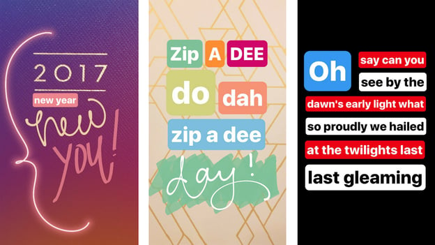
Layer Text: Many Instagram Stories features are similar to a mobile version of Adobe Photoshop or Illustrator. Layering is one of those features. It’s easy to create modern, typographical looks through Stories because of the way Instagram lets users create multiple lines of text that can be manipulated independently of one another, unlike on Snapchat. Play with the sizing of your words, increase and decrease them to give you block lettering, or stagger them for effect. Think about how you’re using capital and lowercase letters. Give different phrases different levels of emphasis. The possibilities are endless, so the best way to figure out what works best is to play around!
Creative Writing: Text and messaging is one thing, but typography is a whole other can of worms. Mix and match script, print, and the type text for a typographic look. Pro tip: use a stylus!
Highlights: An easy way to make text pop is by using the highlighter tool to give it a background. Use different colors to make each word stand out or layer some over others with varied opacity. There’s also the glow text tool which can be used to accentuate written or visual elements of your Story.
Colors
Change Colors: Some brands are just known for their colors -- Tiffany Blue, Target Red, Drybar Buttercup Yellow. What many users don’t know is that they’re able to go beyond the color palette Instagram pre-loads. Simply press and hold and on a color for the entire spectrum to load. TheSkimm does a wonderful job using its “Skimm Blue” in stories. Of course, this isn’t to say you can only do this to utilize a branded color. Play around with different palettes for different messages. Coordinate them with the photo. Bonus: Match a color in your photo with the addition of IG’s color picker tool.
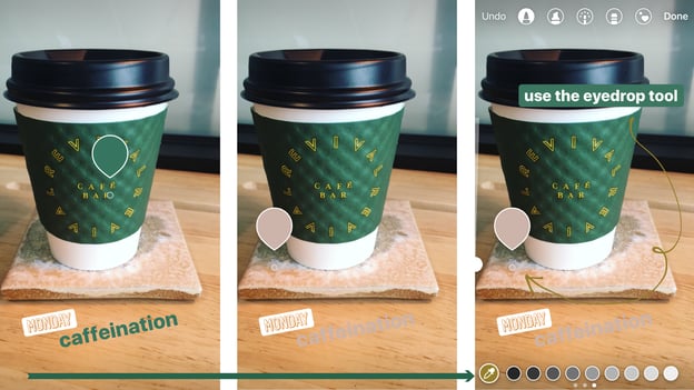
Background: Make your words stand out by giving them a different background. Use the same slider tool to change colors or tap the word box a few times to make it transparent. Stack a bunch of different words s for colorful phrasing and vary the size of your text boxes for a unique look.
Elements
Hashtags: Instagram has a tagging feature in stories that makes stories searchable by hashtag as well. Launching a campaign? Looking to ride the #MondayMotivation train? A hashtag is a great component to add in order to jazz up your story and increase views.
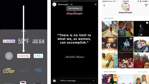
Location: Similar to the hashtag, using the location sticker in your image will ultimately help increase content reach. Both the hashtag and location stickers can be tapped to change their color to match your motif.
Stickers: While we are crossing our fingers that Instagram will continue to expand upon this feature, the platform does release seasonal stickers and includes a full emoji keyboard. There are so many unique ways you can integrate these into your Story. Sharing a product photo or demo? The “like” heart will let your users know how much you love it!
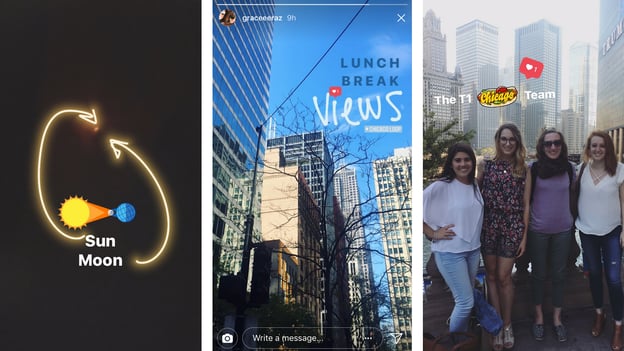
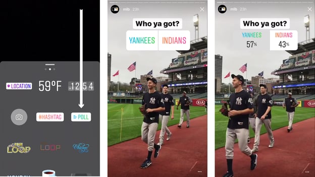
Ask a question: Instagram recently unveiled a polling option for its Stories feature. Instead of just asking a question and slapping the poll on, think about how this tool can be incorporated into your design strategy.
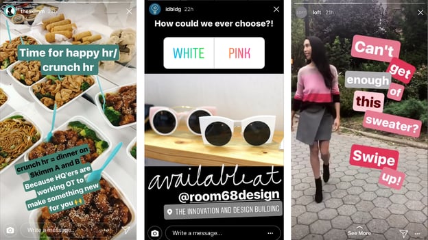
When used in combination, these elements help the average user cross the line to expert designer.
Go Above and Beyond
From Your Camera Roll: Instagram makes it extremely easy to upload any photo you’ve taken in the last 24 hours. Simply click the preview box in the lower lefthand corner and scroll through your options. This is the perfect feature for creating a story series or piecing together a story in advance. For text progression, simply screen shot what you’re working on and upload it again to add another layer of text in the next frame.
Bonus tip: Want to upload a picture but took it more than 24 hours ago? Go into your camera roll and screenshot it. Problem solved!
Varied Storytelling: There is a wide variety of media available to spice up your Instagram Story. Start with a photo, take a video, or try your hand at a Boomerang. Mix and max these elements throughout your story to keep it fun. Get followers to really read your messages by uploading an all-black photo from your camera roll and adding a text overlay. The key here is that there are no rules, so thinking outside of the box (er, frame edges?) is highly encouraged!
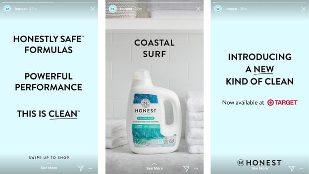
Graphic Design Apps: If you’re following a specific aesthetic and the tools provided in-app by Instagram aren’t necessarily adhering to that look, download an app like Adobe Spark and edit your images. Use a branded font to overlay text or filter your photos for unique branded visuals. Font Candy, Over, and Phonto are all great apps for this.
At the end of the day, what makes Instagram Stories so much fun is that no two are alike. With a full (and always growing!) toolbox, Instagram Stories are really a treasure trove of the designer’s brain. The best way to get better at creating them is by getting started!

